Custom Boxes – Playing With Colors
2024-06-14 23:27:51
So colors can have a huge impact on the way a customer looks at your product and business. Keeping that in mind, you need to be quite careful with the colors you are going to choose for your Custom Boxes. Which is why you need to know all the things colors can do and exactly how. This is how you are going to be able to make the best decision for you.
Colors for your Custom Boxes to Pop
The other amazing and exciting way of making the Custom Boxes packaging and product pop is with the use of color schemes that are appealing, bold, and striking. However, before you dig deeper into the process, we would like you to have a look at some factors that can prove to be helpful in the selection process of the right colors for your packaging.
Colors in your Custom Boxes to target Specific Audience
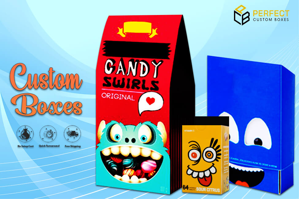
You must know the mindset of your buyers. For instance, think of the age you are targeting and the kind of colors that will go with a specific age. Or the gender. The demography too will play a key role in you selecting the right color for the Custom Boxes. For instance, if you have a product for older people, make sure the colors are somber and calming. You do not wish to offend the elderly. However, the same colors will never do for young minds. They need something bold, striking and exciting.
Colors in the Custom Boxes to send the right Message
There is a message you are trying to send to the world through your packaging and colors. Think about it carefully and then select the colors. What if you select a color for your Custom Boxes packaging that sends the wrong message? The customers will never buy your items. Similarly, you must ensure the colors you are choosing will portray your end goal for the product. This is how brands can make the customers purchase the items in comfort.

Kraft Boxes and the CTA Feature
Every design is going to have a certain CTA or Call to Action associated with it. The color and design you set for the Kraft Boxes packaging must clearly display that. Your packaging should clearly tell the customers what they should do when they look at your product. At the same time, the colors must play with the emotions, feelings and senses of the buyers.
Colors in the Kraft Boxes and the things they are to do
You now know all the things colors need to be able to do for your Kraft Boxes packaging. Because for every element, the color will have a different impact. And when it comes to packaging, the colors you are using and which ones will have a different impact. Which is why you need to choose wisely and carefully. Considering that, we are now going to breakdown all the things certain colors are meant to do. The kind of emotions certain colors that to evoke and the type of feelings that can be associated with a specific color.
White and Black colors in the Kraft Boxes
The color white reflects purity, equality and innocence. It reflects peace. When you use the color white in your packaging, you are sending the impression you have a simple product, but at the same time classy. The white color displays things in a classy manner, yet keeping the simplicity factor intact. Moving on to the next color, black is one of those colors that can reflect an imposing or authoritative features. It displays power and strength. So those brands that have products reflecting such features need to go with the color black in their Kraft Boxes packaging. Moreover, these brands are trying to show their authority over the other ones in the competition.

Red and Green colors in your Cosmetic Boxes
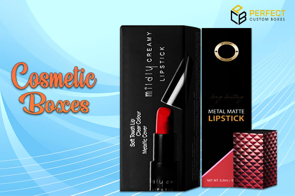
Red is an amazing color that can evoke the feelings of thrill, stimulation and excitement. Therefore, for those products that are exciting or thrilling, brands must use the color red in the Cosmetic Boxes. Moving on, if you want to show some balance or harmony through your packaging for your product, you need to go with green. Because this color gives away a sense of calm and ease. Green is also a favorite color of those brands that have organic or natural products. This is one amazing way of showing the world they have nature-friendly products.
Orange and Blue colors in your Cosmetic Boxes
Another color that can evoke fun, excitement, adventure or thrill is orange. When you choose this color for your Cosmetic Boxes packaging, the customers will instantly get the feeling of adventure or fun. Maybe it can help make up their mind they need a break from the monotonous life and go for an adventure they have been longing for. Blue is one of those colors that can make the general public feel safe, secure and relax. Moreover, this is one of those colors appealing to both genders. It’s a favorite color of a huge number of people globally. Which is why those brands choosing this color are playing their cards right.
Colors in your Cosmetic Boxes and the Product
Now that you know the specific things colors can do, or the senses and feelings these can evoke, you must make sure you are studying your products correctly. So that you can choose the right color for your Cosmetic Boxes packaging. Keep in mind, the colors too need to reflect the kind of product you have inside. At the same time, it needs to represent your brand’s personality. Colors play a key role for a lot of features of the packaging and its design. At the same time, for the product and business. And since your goal is to attract a huge number of people to your products and business, using the right colors will make that happen.

